The Brief Design System: re-architecting the foundation
The MUI-based design system I built for Ad Studio, which then became the design language for redesigning the whole Creatopy platform. A three-layer token architecture and a full component library, built to code with engineering in Storybook.
 ⤢ Click to zoom
Why rebuild it
The platform had outgrown its original system. As it shifted toward AI-native workflows and an increasingly complex editor, the old library couldn't keep pace: inconsistent components, values that drifted between design and code, and no clean foundation to build new surfaces on.
The decision wasn't to patch it. It was to re-architect the whole thing on a new MUI foundation, so the system could scale with the product instead of fighting it. That meant rethinking the structure from the tokens up, not just refreshing the surface.
It started with one product. Ad Studio was the first surface built on the new system, the proving ground for the tokens, the components and the engineering workflow. Once it held up there, the same system became the design language for redesigning the rest of the platform. See Ad Studio, the product it first shipped in →
The architecture
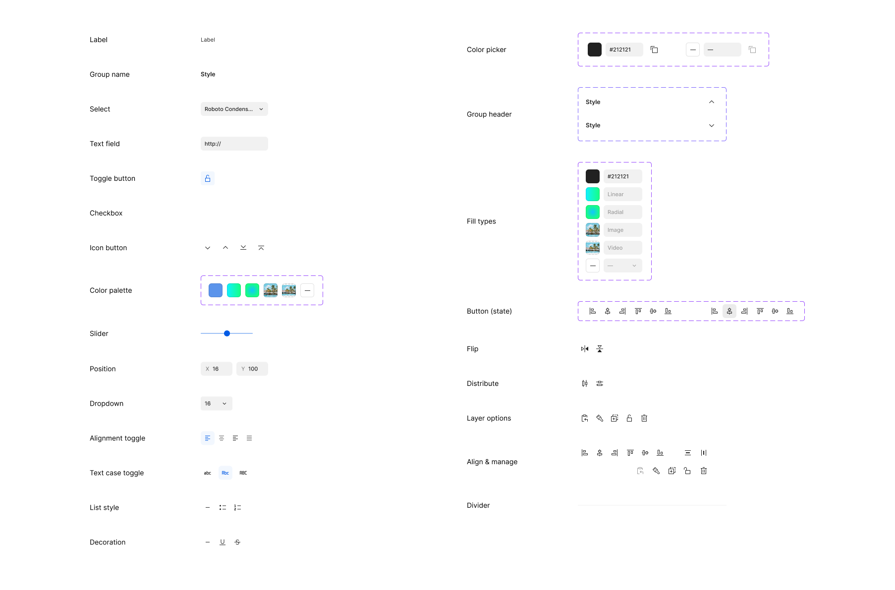
The core of the system is a three-layer token model, each layer building on the one beneath it. Primitives define the raw palette and scales; a semantic layer maps those primitives onto meaning; and components consume only the semantic layer, so the rest of the system never references a raw hex or pixel value directly. It references intent.
This is the whole point of the structure: because components reference semantic tokens and semantic tokens reference primitives, a single change at the bottom flows through the entire system without hunting through files. Rename the intent, not a thousand hex values.
Real tokens from the system. Note the naming: intent first (Action, Text, Warning), never the colour. Even alerts get their own semantic sub-group.
How it composes: atoms, molecules, and a full element matrix
The system is built to compose. Atoms are the smallest sanctioned pieces: a label, a select, a text field, a toggle, an icon button, a colour control. Molecules assemble those atoms into the functional rows of the editor's properties bar. Nothing in a molecule introduces a new value; it only arranges atoms that already exist.
The hardest part wasn't any single component. It was the combinatorial problem underneath: the editor supports many element types, each with a different set of editable properties. A text layer, a video, a countdown and a particle effect don't expose the same controls.
So I mapped the whole space as a matrix: every element type against every property, with the correct property bar resolved for each combination, all from the same atoms and molecules. That's what keeps the editor coherent no matter what the user selects, and it's the structure that makes adding the next element type a known, bounded task instead of a redesign.
 ⤢ Click to zoom
 ⤢ Click to zoom
 ⤢ Click to zoom
The type system
One family, worked hard. Inter carries the whole UI, every step a named, defined token with a fixed size, weight, line-height and letter-spacing, so type is applied by role rather than eyeballed per screen.
Inter · 600
Inter · 400
Inter · 500
Real type tokens. Roles, not one-off sizes, so the ramp stays consistent across every surface.
Governance: what's in the system, and what isn't
A system is only as strong as its boundaries. On the atoms page I split every element into “components used” versus “variants or ideas only.” Sanctioned atoms on one side, exploratory work clearly fenced off on the other.
That line matters more than it looks. It tells anyone opening the file exactly what's safe to build with and what's still thinking-out-loud, which is what stops a system from quietly sprawling into a dozen near-duplicate buttons.
 ⤢ Click to zoom
Key decisions
Build on MUI, not from scratch
I based the system on Material UI rather than inventing every primitive. MUI gave a battle-tested foundation and a structure engineering already understood, so the team could move faster and lean on a known accessibility baseline.
Layered tokens, not flat references
I split tokens across primitives, a semantic layer, and the components that consume them, rather than letting anything reference raw values directly. It's more upfront structure, but it's what makes the system maintainable at scale.
Govern by drawing a hard line
I made the sanctioned-versus-exploratory split explicit in the file itself, rather than keeping it in my head. Governance you can see is governance the rest of the team can actually follow.
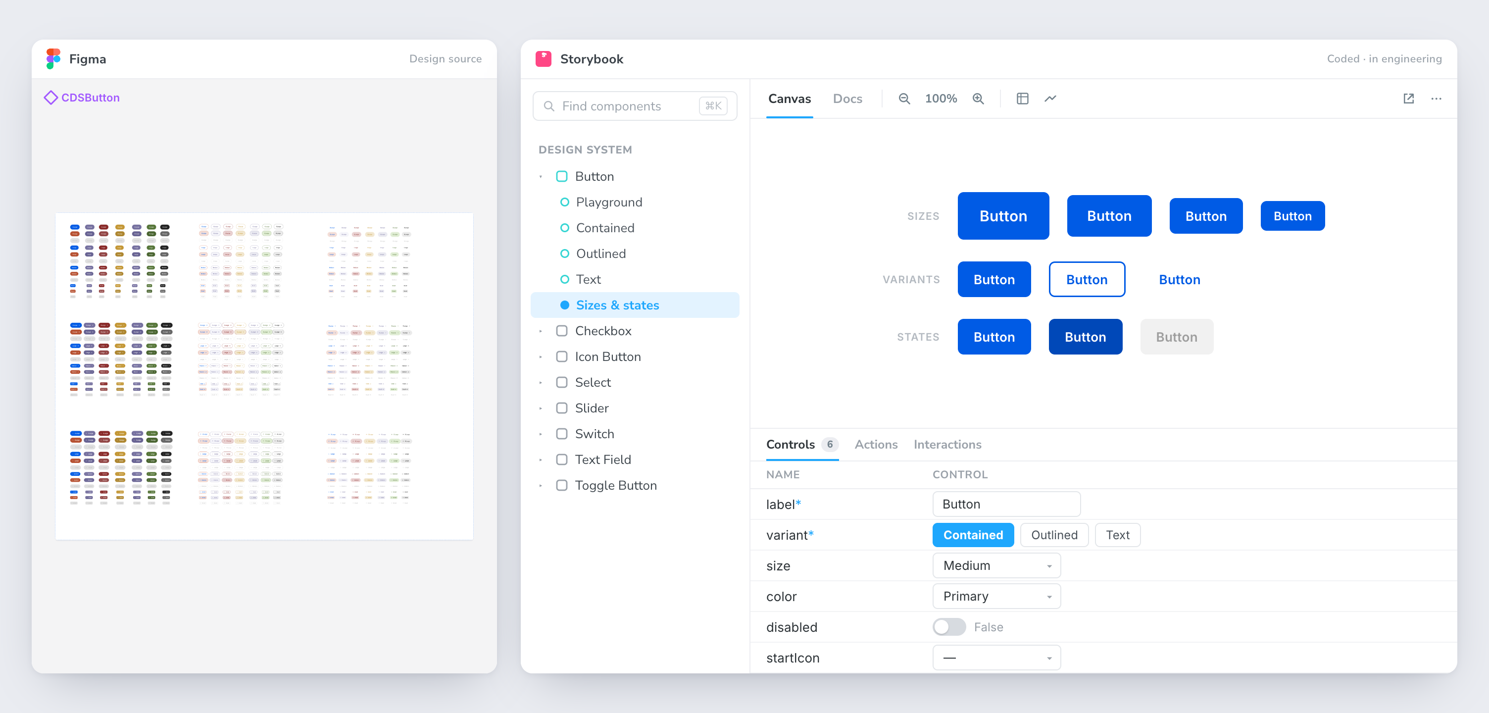
Design-to-code parity
A system that only lives in Figma is half a system. I worked directly with engineering to build the components in Storybook, the full set: inputs, buttons, selects and the rest, so the design source of truth and the coded source of truth were the same thing, not two drawings of it.
The shared MUI base and the semantic token layer are what made that parity practical: when design and code speak the same structural language, handoff stops being a translation exercise and the gap where drift creeps in mostly closes.
We proved the whole pipeline in Ad Studio first, design tokens to Figma components to Storybook to shipped UI, then rolled the same components out as the platform was redesigned around them.
 ⤢ Click to zoom
Outcome
- From one product to the whole platform. Proven in Ad Studio, then adopted as the design language for redesigning the rest of the Creatopy platform.
- A scalable foundation the platform's newer AI-native surfaces are built on, instead of a library actively slowing the work down.
- Predictable change. The two-layer token model means a foundational update flows through the whole system without manual hunting.
- Tighter handoff. Storybook parity and a shared MUI vocabulary cut the translation work between design and engineering.
- A coherent system, not a sprawl, held together by an explicit line between what is sanctioned and what is exploratory.
Reflection
A design system isn't a library of components. It's a set of decisions about how decisions get made, and the real work is the architecture underneath, not the screens on top.